Rebranding design
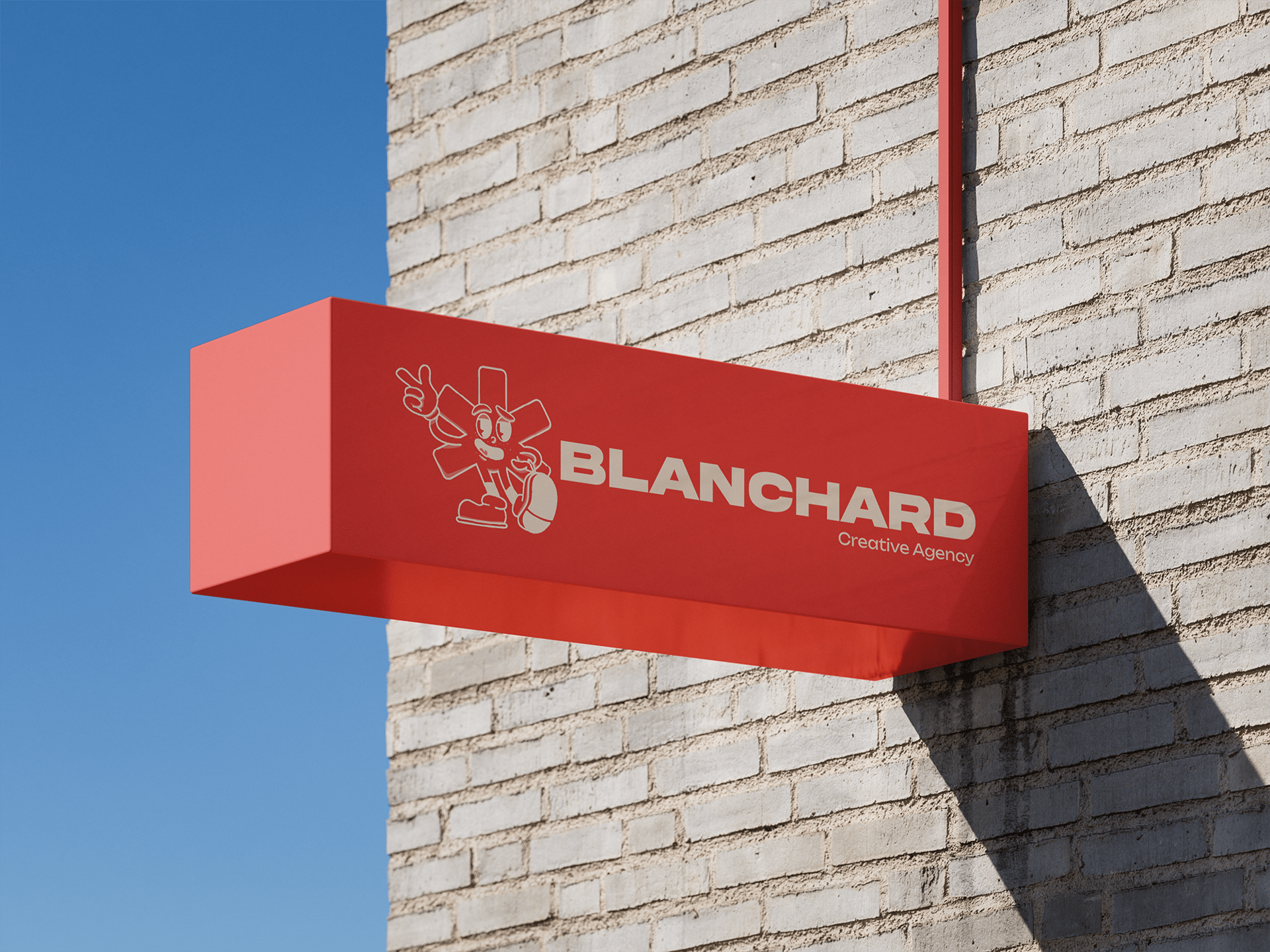
The rebranding of BLANCHARD, a creative agency from Barcelona, was conceived to bring a fresh, cohesive, and more dynamic visual identity. The goal was to highlight its creative essence, combining boldness with clarity, and to create a system that feels both professional and playful, while staying true to the agency’s roots.


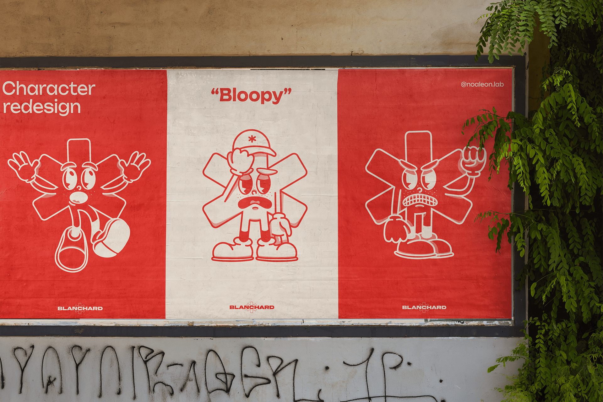
Character redesign
The brand character Bloopy, originally a six-pointed asterisk symbolizing the six artistic disciplines at the core of BLANCHARD, was reimagined in line with 2025 trends where brands embrace playful, cartoon-inspired illustration to feel approachable and human. Drawing from vintage aesthetics, the updated design adds movement, personality, and expressiveness, making it more engaging, versatile, and a strong reflection of BLANCHARD’s creative spirit in today’s visual culture.

Color Palette
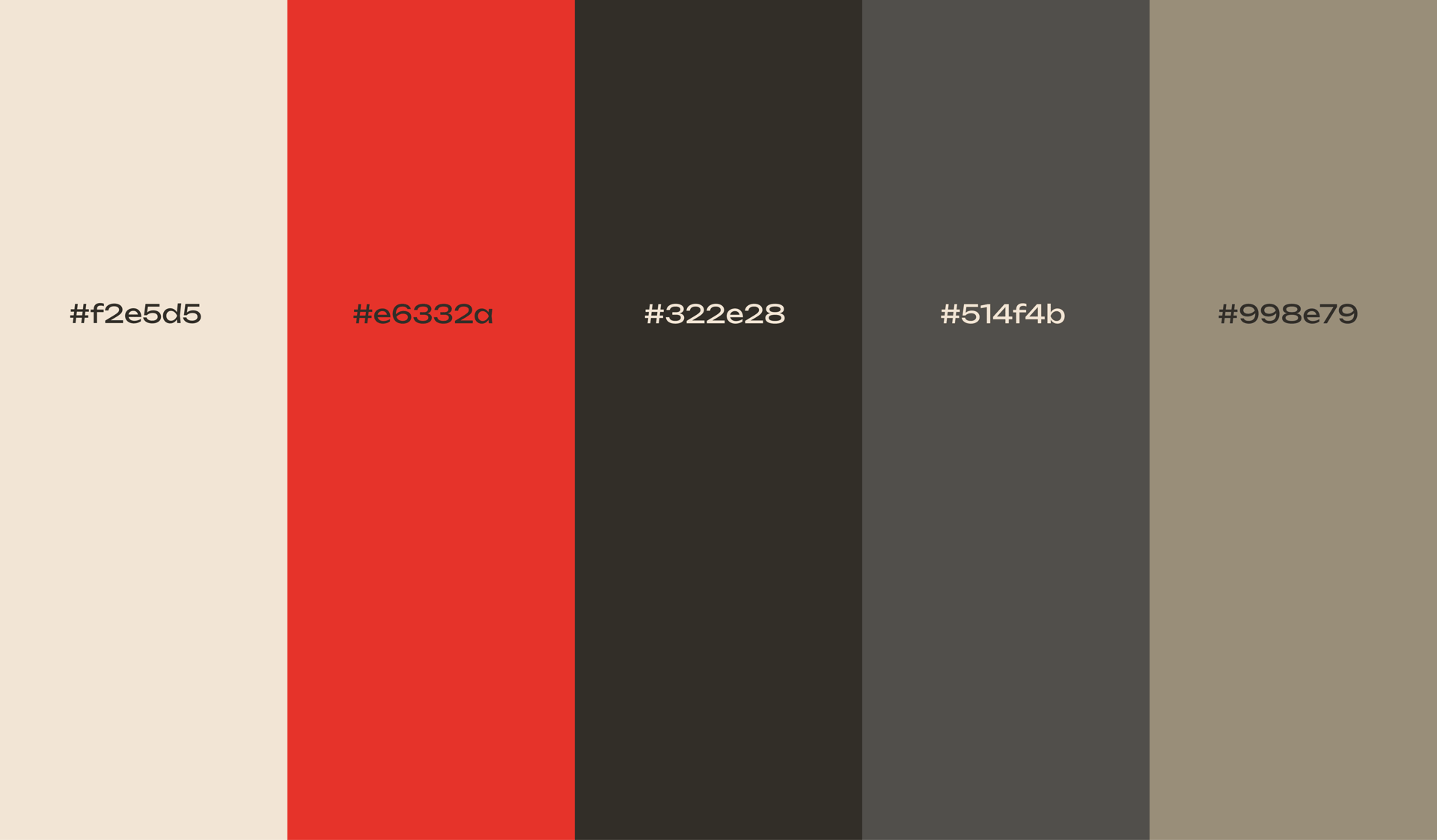
At the core of the new identity lies a vibrant red (#e6332a), chosen for its strong association with passion, creativity, and innovation. This red immediately captures attention and serves as the emotional driver of the palette. To balance this intensity, softer neutrals like beige (#f2e5d5) provide warmth and accessibility, while darker tones such as deep gray (#322e28) and blue-gray (#514f4b) offer contrast and grounding. Together, these colors create a versatile palette that communicates both energy and trust, ensuring adaptability across digital platforms and printed media.


Typography
Typography plays a key role in shaping the new identity. Akira Expanded, used for the logo and titles, delivers boldness and impact, reflecting the agency’s strong and confident presence. Its geometric and expanded shapes also give a contemporary feel that resonates with the forward-thinking ethos of the brand. For paragraphs and supporting text, Unbounded was selected for its clean, rounded forms, offering a softer counterbalance to Akira. Its readability and modern character allow longer texts to remain approachable while maintaining a consistent, polished aesthetic. The combination of both fonts enhances hierarchy, clarity, and personality in every design application.
Project context
This rebranding proposal was originally developed as part of a creative contest for BLANCHARD’s new identity. Although this direction was not ultimately selected, the project allowed for the exploration of bold concepts, from vibrant color theory to expressive typography and character design. The result is a cohesive and innovative visual system that demonstrates how creativity, attention to detail, and experimentation can reshape a brand’s personality and strengthen its presence.